

The header is one of the first elements on a website that catches our attention, and for a good reason. It’s the area where our eyes automatically look for information about the website we’re visiting. For a long time header layout was the least customizable part of a WordPress theme, but with the full-site editing ( FSE ) that’s changed. In this article, we’ll see how easy is to set up and customize the header in a block WordPress theme with FSE. Let’s go!
Elements of a Website Header
On most websites in the header, we’ll find important bits of information like the site title or logo or both, so we know we are on a website we wanted to be on. Then there is most often the main navigation menu that gives us an overview of what this site has to offer. Sometimes headers include information like a contact number or email, links to your social networks, and even a search bar.
In general, you can split header elements into three basic sections:
- Site Title and Logo
- Navigation Menu
- Additional Elements
With this in mind let’s start setting up the header of your website. As an example, I’ll use one of our popular block FSE themes, Bricksy Pro.
Choose Your Header Layout
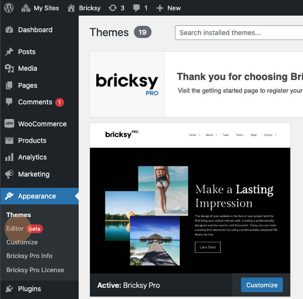
With a modern block FSE WordPress theme like Bricksy Pro everything related to the header is done in the new Site Editor. In your WordPress dashboard navigate to Appearance->Editor.
Once you open the editor you’ll notice that it looks somewhat similar to the block editor in pages and posts. However, they do two very different things so it’s important to tell these two editors apart. The new Site Editor enables you, among other things, to set up and customize headers and footers which page/post editor doesn’t do.

With Bricksy Pro there are around a dozen predefined header layouts to choose from. To access these layouts select the header area and then click Replace Header.
Quick Tip: if you have a hard time selecting the whole header and are selecting different header elements instead, use the List View and select the header there.
As you can see the header is built entirely out of blocks. The outside block is a Group block, followed by an inner Row block with a Site Logo & Navigation.
When you select the header layout it is automatically applied and you can proceed with adjusting the elements.
For this example, I’ll use the default layout with the Site Logo on the left and Navigation on the right.
How to set up a Logo or a Site Title?
- Logo
Most websites use either logo or a site title, it’s rarely both. So, in this default layout, the starting point features only the logo, but you can easily change that to Site Title if you wish.
To add your Site Logo, click the Site Logo block -> Replace and upload your own logo image.
You can select any block by simply clicking the icon directly in the content area or by using the List View as shown in the screenshot below.
You can customize your Site Logo via the Block Settings in the sidebar. Here you can change the image width, link it to the home page, make it open in a new tab or use it as a site icon.
- Site Title
If you want to use a Site Title instead of the Logo, you can delete the Site Logo block and add the Site Title block instead.
To remove the Site Logo, simply click on the three dots in the toolbar and you’ll see the list of options. At the bottom, you’ll find Remove Site Logo.
After you deleted the Site Logo you can add your Site Title Block by clicking on the + sign.
If you don’t see the Site Title block listed right away use the search field and then click on the Site Title Block to add it.
Now you can edit and customize your Site Title via the Block Settings. There are options to adjust colors, the font family, font weight, letter case, or size of your Site Title.
The alternative way to switch from logo to site title block would be to use the transform feature. When you select the logo block just click the block icon in the toolbar ( see screenshot below ) and in the transform window select Site Title.
Of course, if you want to use both logo and site title you can do that by adding an additional block either as a new column or a new row whichever fits better to the layout you selected.
How to Set Up the Main Navigation Menu?
Select the Navigation block by clicking on it or use the List View to navigate to the navigation block.
If you have previously created menus, they will be available when you click Select Menu.
To start from scratch select Create New Menu-> Start Empty. The Navigation menu will look just like a block inserter with the + icon. Use this to add links to specific pages.
When you click + the text will change to Add Link. Here you can search for the name of a page or post already created.
To add another navigation item simply click + again and search for the page(s) you want to add.
Add Submenus to Your Main Navigation Menu
Click on the menu item to which you want to add a submenu and then click on the Add Submenu icon.
Once you clicked on add submenu a new + button will appear beneath the main one. With this button you can add any pages you want to appear in the submenu of the selected menu item.
Ordering Navigation Menu Items
After getting the menu items in place, you may want to re-order the menu items you added to your navigation. To do that use the Move left and Move right arrows in the toolbar.
You can also use the List View to drag and drop items around.
When you’re done with setting up your menu make sure to save it by clicking the Save button in the top right corner.
Change Menu Item’s Name and Link Destination
Sometimes you might want to change the name of an existing menu item. To do that just click on it, delete the old name and type the new one.
To change the link destination, select the Link icon in the block toolbar, then click the pencil icon, and in the field add the new URL for your menu item.
You can also make your page open in a new browser tab by simply enabling the Open in new tab option.
Additional Header Elements
As I mentioned before besides the logo and the menu it’s possible to add a variety of other elements. The default header layout I used as our example doesn’t include additional elements, but these can be added above the main row which includes the menu and logo by simply clicking the + button above it.
You can add any block you want, create columns, and much more. Once you created the new row you can also place it beneath the navigation and logo by simply using the Up and Down arrows in the block toolbar.
Use Header Layout with Additional Elements
Instead of creating additional elements for the default layout, you might be better off using a predefined header layout that includes additional elements. Bricksy Pro includes a few well-designed options.
Select the Header area or use the List View to select the header and in the toolbar use the Replace option to select the new header layout.
For this example let’s select the Header Double with Info Bar at the top and Logo & Navigation under.
Top Info Bar has three columns; a Paragraph block on the left, Social Icons block in the middle, and a Button block on the right. We can also see the structure in the list view.
Of course, you can rearrange these three columns, add more, change the alignment of each element in the columns, and more.
Paragraph Block
In the paragraph block, you can add your contact number, email, or anything you see fit for your project.
You can edit the text in the Paragraph block by simply clicking on it. You can also change the text and background colors, and adjust the font size from the block settings in the sidebar.
Social Icons Block
In the second column, you’ll find sample Social links. Make sure to add links to your social profiles in the block settings. You can also add more social icons or delete some of the sample ones.
To add a new social icon click the + button and search for the social link blocks by typing the name of the social site into the search bar.
In the block settings, you can adjust position, style, color, and more.
Button Block
This header layout comes with the button block on the right. Click on it to add your own text and use a block toolbar link icon to add a link to any page you want. There is a variety of different styles and customization options in the block settings as well as in the toolbar.
Test Test Test
I encourage you to play around and test all the different options to see what they are doing. It’s the best way to learn the ins and outs of the editor.
If you get lost and can’t find your way back you can always use the undo button in the top left corner of the editor to bring you back to safety.
When you’re done with your header make sure to save changes and then visit your homepage to check if everything looks as expected. If required adjust your header settings accordingly.
Summary
As you could see in our examples having the header built out of blocks opens so many possibilities. You can stick to one of the themes’ predesigned layouts and just edit the content, but you can be also creative and adjust each element to your liking or even add new elements. I tried to cover as many header features in this article, but I’m sure you’ll discover even more by just playing around with it. With modern block FSE themes like Bricksy Pro or Basti you have access to all these options at your fingertips.
If you liked this tutorial then you might like this one as well: Create a WordPress website with a Block (FSE) Theme ( Beginner Friendly )
Thank you for the detailed tutorial. This type of tutorial will help to promote the use of block themes.